Case Study: UniHomes

Key Results

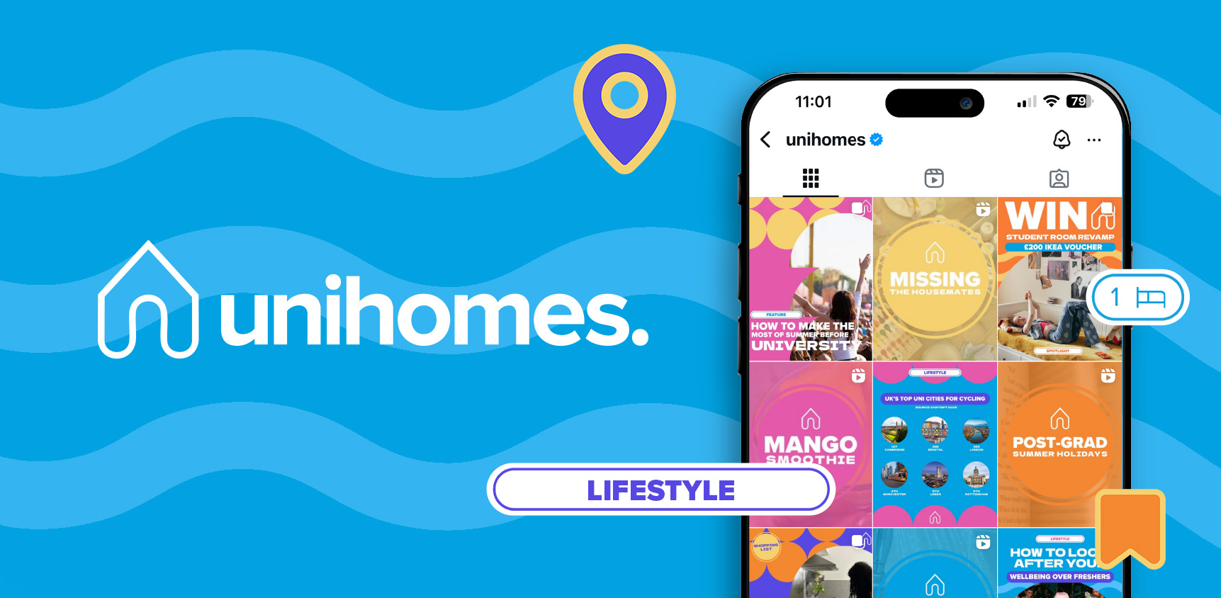
A refreshed Instagram presence with a bold, unified visual identity

Timeless, stylish designs with distinctive circular and rounded motifs

Streamlined content production process for the in-house social media team

Key Results

A refreshed Instagram presence with a bold, unified visual identity

Timeless, stylish designs with distinctive circular and rounded motifs

Streamlined content production process for the in-house social media team

CLIENT

UniHomes

SERVICE

Graphic Design

INDUSTRY

Student Accommodation

CLIENT

UniHomes

SERVICE

Graphic Design

INDUSTRY

Student Accommodation

The Brief

UniHomes is the market-leading student accommodation advertising platform and utility management provider, having helped hundreds of thousands of students find their perfect all-inclusive university ‘home from home’, by connecting them with its established and ever-increasing network of letting agent partners.

Founded in 2015, UniHomes now operates in over 60+ university towns and cities across the UK, utilising its innovative technology platform, services, and student utilities package to simplify and enhance the entire student lettings process. Providing all the tools to student renters and letting agents in one straightforward and transparent solution, UniHomes is opening new doors to stress-free living – one all-inclusive ‘home from home’ at a time.

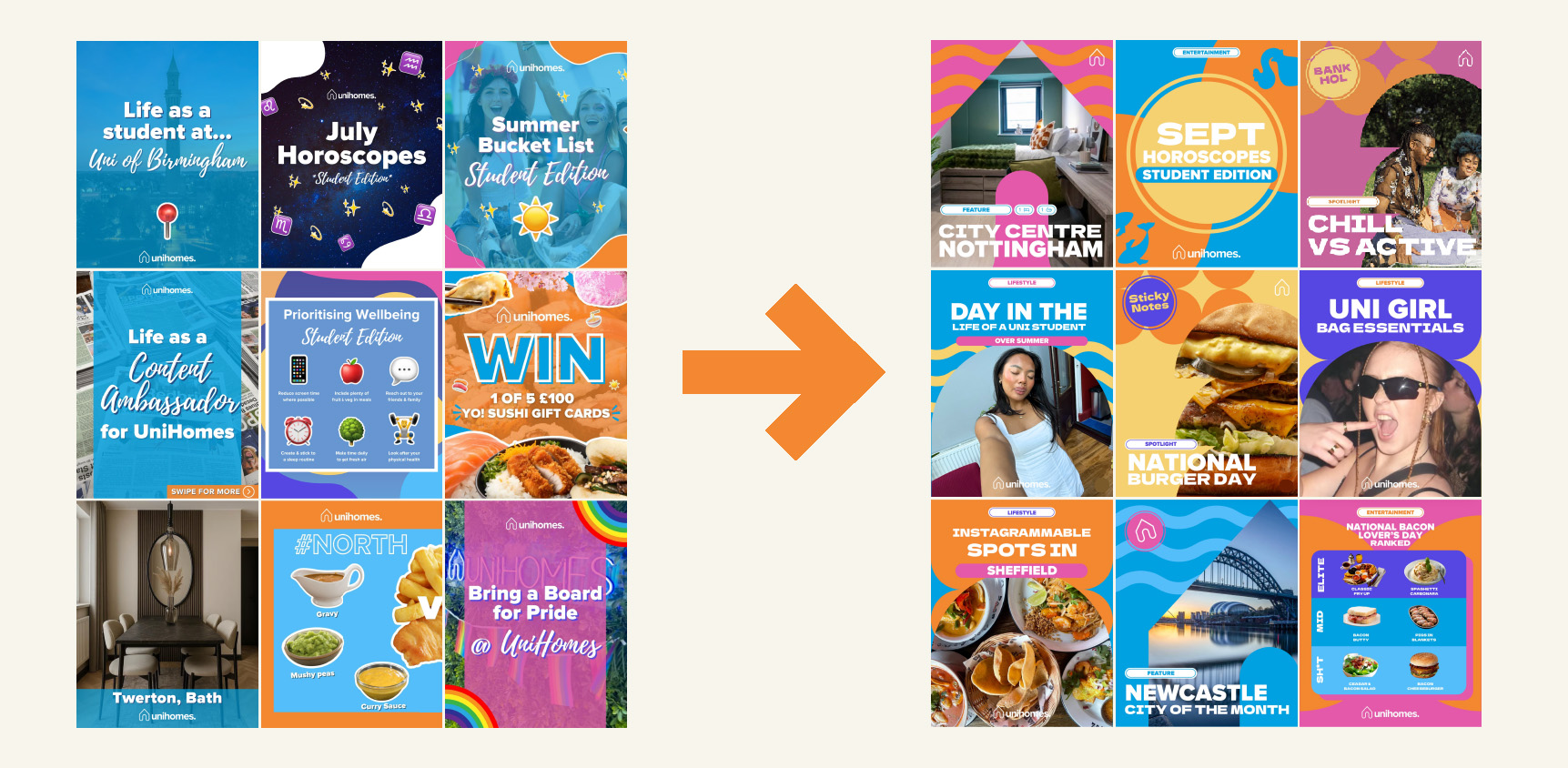
UniHomes asked us to give their Instagram presence a fresh new lease of life. Their existing style was familiar and consistent but had been in place for some time, and there was an opportunity to make it feel more relevant to today’s students while keeping the essence of what their audience already recognised. The aim was to create a visual refresh that felt bold, playful, and instantly relatable for 18–21-year-old university students, while making day-to-day content planning and production easier for the UniHomes team. The refresh needed to move away from elements perceived as overly feminine and create a feed that would stand the test of time, avoiding short-lived trends while still feeling modern and unique to UniHomes.

KPIs

Establish a consistent visual identity across Instagram

Cut through noise and standout against competitors

Create structure to support our content strategy

THE CHALLENGES

  • Refreshing the aesthetic while staying true to UniHomes’ established branding
  • Balancing a bold, modern style with timeless visual appeal
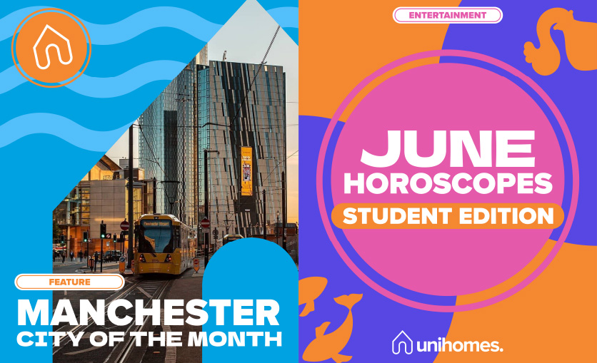
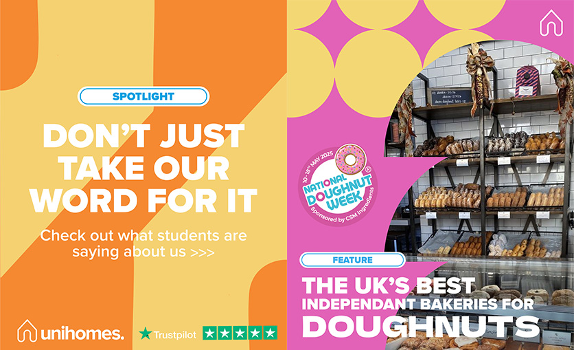
  • Creating visual variety and cohesion across posts using a new ‘bold shapes’ direction with circular motifs, rounded edges, and playful sticker-like elements
  • Ensuring the feed felt dynamic and engaging without becoming repetitive

THE WORK

We began by identifying elements students already associated with UniHomes and explored how to reimagine them in a fresh, engaging way. The UniHomes house logo shape became a recurring visual device, used in backgrounds and image frames to subtly anchor posts back to the brand.

A new display sans-serif typeface was introduced to give the feed a modern, bold aesthetic, replacing the previous script style. Titles in block capitals added energy and confidence. Circular motifs were varied in size, placement, and colour to maintain cohesion while avoiding repetition. Rounded edges, bold shapes, and playful sticker-like elements added visual interest, inspired by other brands appealing to the same audience. Looser layouts made the feed feel dynamic and eye-catching.

We also advised the client on the types of imagery to use in posts, ensuring that photos worked harmoniously with the new templates and resonated with their student audience. This guidance helped unify the look of the feed and brought the new visual identity to life.

The refreshed visual identity was designed with flexibility in mind, enabling the UniHomes team to adapt content easily while maintaining cohesion across posts.

THE RESULTS

The UniHomes team loved the new style and have since rolled it out across other brand touchpoints. The feed now presents a polished, vibrant aesthetic featuring bold circular motifs, rounded elements, and playful details. The refresh has made content planning and production significantly easier for the in-house team, while reinforcing UniHomes’ brand as engaging, modern, and recognisable to its student audience.

“As we’ve worked with OCPR on several projects over the last 3-years, we felt they had a clear understanding of our brand’s personality and the vision that we were trying to achieve across socials. We wanted to create an instantly recognisable Instagram Feed, that cut through the noise and set us apart from our competitors, whilst also providing a templated structure to accelerate the execution of our content strategy. We’re thrilled with the end results, as they’ve achieved a bright, bold, and cohesive Feed that resonates with our audience, and after the first month of using the new structure, we’re already seeing results.”

Hannah Martin-Singh
Senior Marketing Manager, Brand Activation UniHomes

Like what you see?

If you think your business can benefit from any of the services in this case study, get in touch by filling out the form.

We’d still love to hear from you even if you aren’t sure, let’s have a conversation and see where it goes. After you’ve filled out the form, one of our team will endeavour to be in touch within 24 hours.